Classic Blue: Design Challenge
In 2020, Classic Blue was Pantone’s as the colour of the year.
The colour number in Pantone library is PANTONE 19-4052, CLASSIC BLUE.
Classic Blue is timeless, elegant and reminds us of the infinity of evening sky. The universal and natural features of this colour render it suitable for any furniture, décor or walls that can be based on this tone.
This is every interior designer’s secret method when it comes to creating a moodboard. It is to find a painting and use it as a colour palette, as an inspirational idea for the interior space and furniture style.
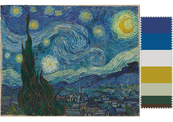
Classic Blue Moodboard
The Starry Night by Van Gogh can serve us as a great inspirational moodboard for the colour scheme where Classic Blue is the leading color. It gives us a fairly unique colour scheme, modern but with a nod to heritage references.
Classic Blue in the Kitchen
A fresh new look for trendy kitchens, Classic Blue kitchen cupboards will retain their timeless elegance for many years to come. Installing a completely new kitchen in Classic Blue will require a designer’s eye. We suggest you can add some of the complementary colours form the above colour palette so that the overall composition of the colour scheme is a confident one. Traditional kitchen materials such as Carrara white marble or birch timber will look exquisite when combined with Classic Blue cabinets or your kitchen island.
If you would like to just freshen up your kitchen, without any dramatic changes, why don’t you apply Classic Blue to the splashback and then repeat it with some accessories, such as pots for plants, kitchen towels. You may add a splash of paint to some wall in the kitchen. Try to use at least three colours from the palette, Classic Blue and two others.

A serene kitchen interior bathed in the rich, calming tones of classic blue PANTONE 19-4052, evoking a sense of nostalgia and warmth, with creamy white cabinets, subtle wood accents, and sleek, minimalist hardware, set against a backdrop of warm, beige-hued walls, and a gleaming, stainless steel kitchen island at its center, illuminated by soft, warm lighting that casts a gentle glow on the polished, dark hardwood floors, all carefully composed to create a sense of balance and harmony.
If your current kitchen is quite dated, why don’t you take a bold step of painting your cabinets in the scheme of Classic Blue? Please make sure you have applied professional steps to preparing and painting the surfaces. There is plenty of online video tutorials that teach how to paint kitchen cabinets. While at it, update the handles of cabinet doors to give your kitchen the feel of a professional new look. Again, look at how you can incorporate at least three colours of the scheme. Colour and repetition are an easy set of tricks worth applying here.
Classic Blue in the Living Room
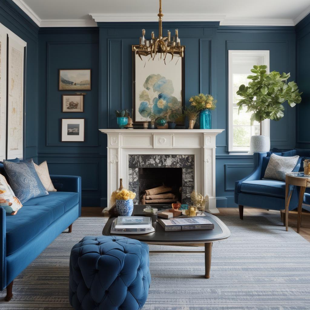
Stylish living room with Classic Blue accents
Bring timeless elegance and universal relaxation to your main room. To paint the whole living room in Classic Blue would require excellent interior design skills. Instead, you may consider painting a feature wall and then repeating Classic Blue in curtains, cushions, a new vase or a floor rug. Juxtapose Classic Blue against the other two colours from the above colour scheme, set them together and repeat them together. Mustardy yellow is a very natural complementing colour for Classic Blue, and greyish off-white softens the design even further. As always, greenery adds organic feel to any space. Dark green plants will contribute not only references to nature, but they will also create a very unique colour combination, modern and yet universally timeless.
Classic Blue in the Bedroom
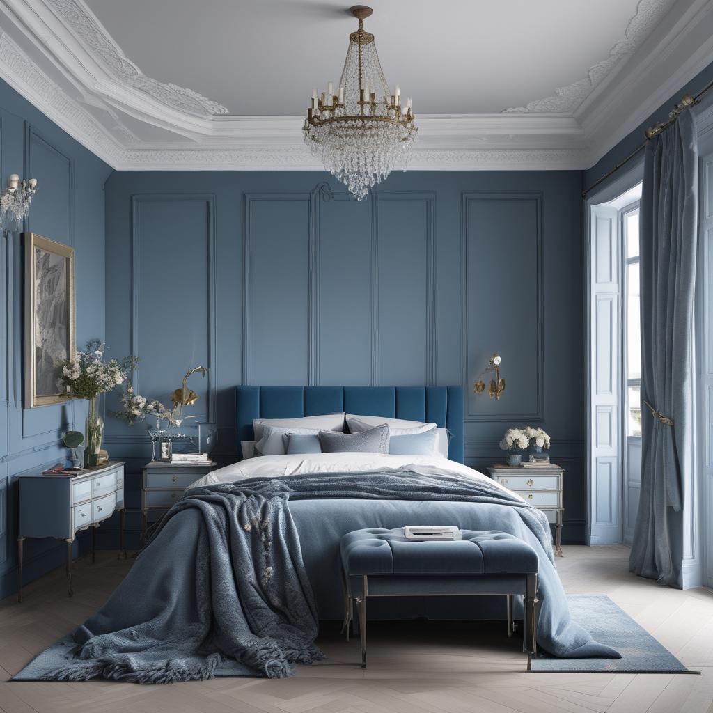
Romantic bedroom in classic blue colours
This is THE colour for bedrooms. Doesn’t it make you sleepy straight away? In your bedroom you can indulge in Classic Blue left, right and centre. It can be safely applied as the colour of your feature wall, but it will look equally excellent on all walls of the room. Add a colour or two from the complementary colours of the above colour scheme and you have a confident and elegantly styled space. The other two colours don’t have to be the bright ones, such as yellow. For a bedroom you can add the off-white and hints of brown, for example. You can repeat Classic Blue in elements of your bedding, such as cushions, decorative items on your bedside tables, or a piece of wall art. How about having a print of the famous painting by Van Gogh, The Starry Night?
Classic Blue in the Bathroom
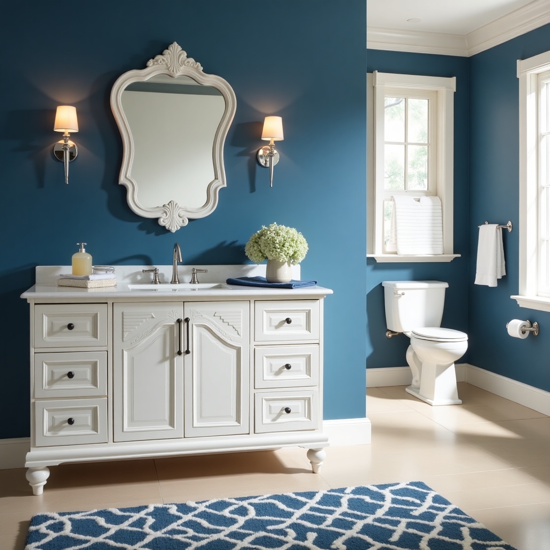
A bold bathroom sanctuary featuring strong, rich classic blue accents in PANTONE 19-4052, which adorn the walls, cabinets, and decorative accessories, evoking a sense of calming sophistication. The blue hue is balanced by crisp white fixtures, sleek chrome hardware, and a hint of warm beige or cream tones in the flooring and countertops, creating a harmonious contrast. The room is illuminated by soft, warm lighting, casting a gentle glow on the polished surfaces. A elegant, ornate mirror hangs above a stylish, wall-mounted sink, while a plush blue and white area rug adds a touch of comfort and coziness to the space. The overall aesthetic is one of refined, timeless elegance, perfect for a relaxing retreat.
To go with large scale areas of Classic Blue in the bathroom would be a bold but equally risky idea. The color is strong and imposing and it bears heavy resemblance to water elements, so an inexperienced designer may create the mood of overwhelming cold aquarian ambience.
However, good results can be achieved when Classic Blue is used in moderation, on one or two walls, and it is complemented by warmer colours, such as mustardy green and neutral brown in the above colour scheme based on Van Gogh’s famous painting. Naturally, you may also soften the overall effect by applying one of the more neutral colours from the scheme too, such as off-white.
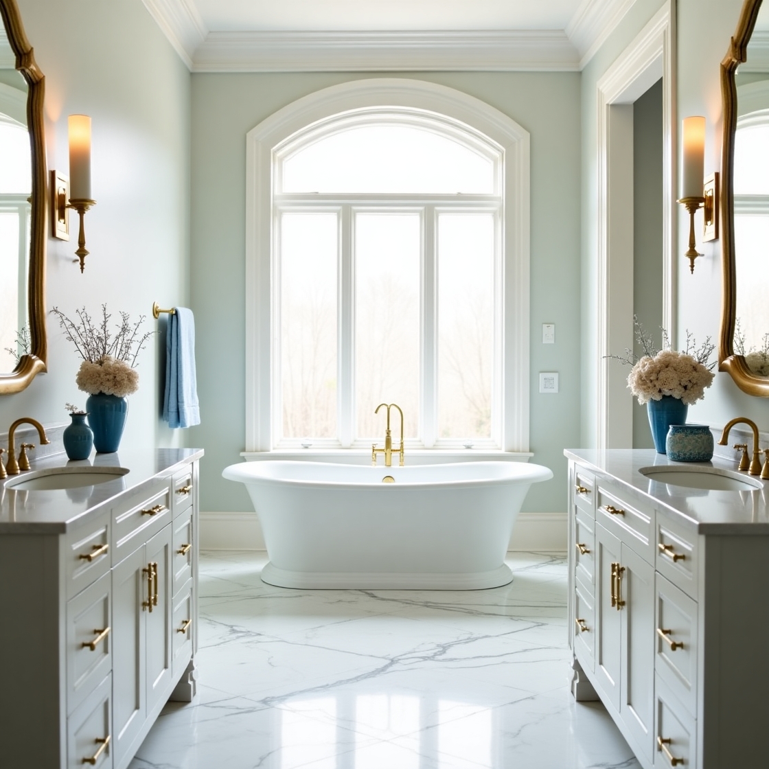
A classical marble bathroom with gentle blue accents in PANTONE 19-4052, features elegant white marble walls and floors, complemented by intricately veined countertops and a majestic freestanding tub, surrounded by soft, creamy whites and subtle gold hardware, with strategically placed blue undertones in the ornate sink fixtures, decorative vases, and a statement wall mirror, set against a warm, comforting ambiance with soft, diffused light pouring in through the frosted glass windows, creating a sense of luxury and relaxation.
Classic Blue will look great when combined with white marble surfaces or timber-like tiles.
NOTE OF CAUTION RE CLASSIC BLUE
When choosing a few items in Classic Blue for your interior, please make sure you compare the tones of blue together, and in different light: natural daylight outdoors, but also in the type of lighting you have at home. Tones of blue will look very different in harsh light of supermarkets and homewares stores, and they will play a very different game in warm or daylight colours of your light bulbs at home.
If you are planning to paint walls or cupboards, I suggest you paint a sizeable sample (at least A4 page) and take it to shops to put it against the other items in Classic Blue you are planning to buy. Remember, cushions, fabrics and glass items – unlike print – will not be in exactly Pantone Classic Blue, so you will have to match the colours yourself. NEVER do it by guessing. Also, when ordering items online, try to get fabric samples sent before the purchase – unless the item is inexpensive and you are prepared to take the risk. If the item is inexpensive, sellers may not be able to send you samples. But be warned – textile colours and photos online rarely look closely similar to the reality. The other option is to return the items to the seller if they don’t fit your décor and if the selling conditions allow for return.
Happy decorating,
Xena
