ELEMENTS & PRINCIPLES OF DESIGN: Colour & Gradation
The Easiest and the Safest Way to Improve the Look of Any Room
If you are new to interior design, you should certainly give this idea a go. If you feel comfortable with remodeling spaces, by all means, use it as well. It is such a great and, at the same time, easy method.
You should start with deciding what colour it is going to be about. Either pick a colour that your room already has, such as the color of walls, a feature wall or a wallpaper – or you can decide to ADD a new colour that will co-exist harmoniously in your room. Then you will need to find decorative items in different shades of this colour and plan where you will place them throughout the room.
ELEMENT
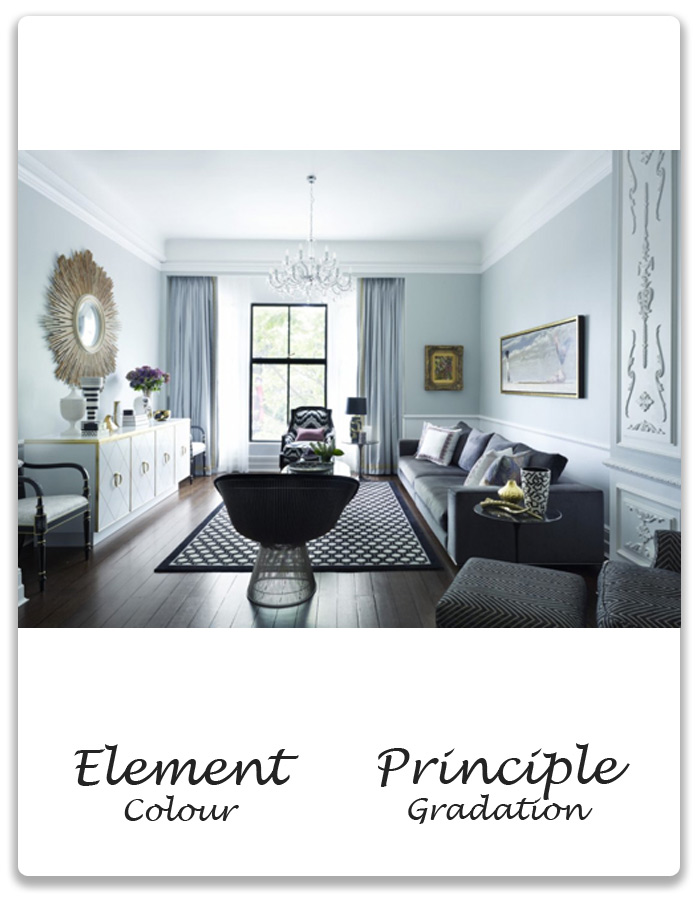
Colour refers to the amount and type of pigment, hue, value, saturation and perceived temperature. In this room the discussed colour is grayish blue.
PRINCIPLE
Gradation of colour from warm to cool and tone from dark to light produce aerial perspective. Gradation can add interest and movement to a shape. A gradation from dark to light will cause the eye to move along a shape. In the above example we have a gradation of the grayish-blue colour, from very light shades of the walls, cupboard and seat covers, through medium shades of the curtains and motifs in the painting, to darker shades of the sofa and cushions, to the darkest, grayish navy colours in the floor rug, the armchairs, the lounge chair and in the decorative elements standing on the cupboard.
OUTCOME
Gradation of the colour throughout the room creates harmonious but visually interesting space. The mood is peaceful and relaxed but the eye of the viewer is being compelled to keep discovering next elements in this colour gradation spectrum.
Next page: How to Ensure Harmonious Space When Planning for the Interior Design and Decoration of Your Room
Resources
Greg Natale, Interior Designer
http://gregnatale.com/index.
